THE PROBLEM
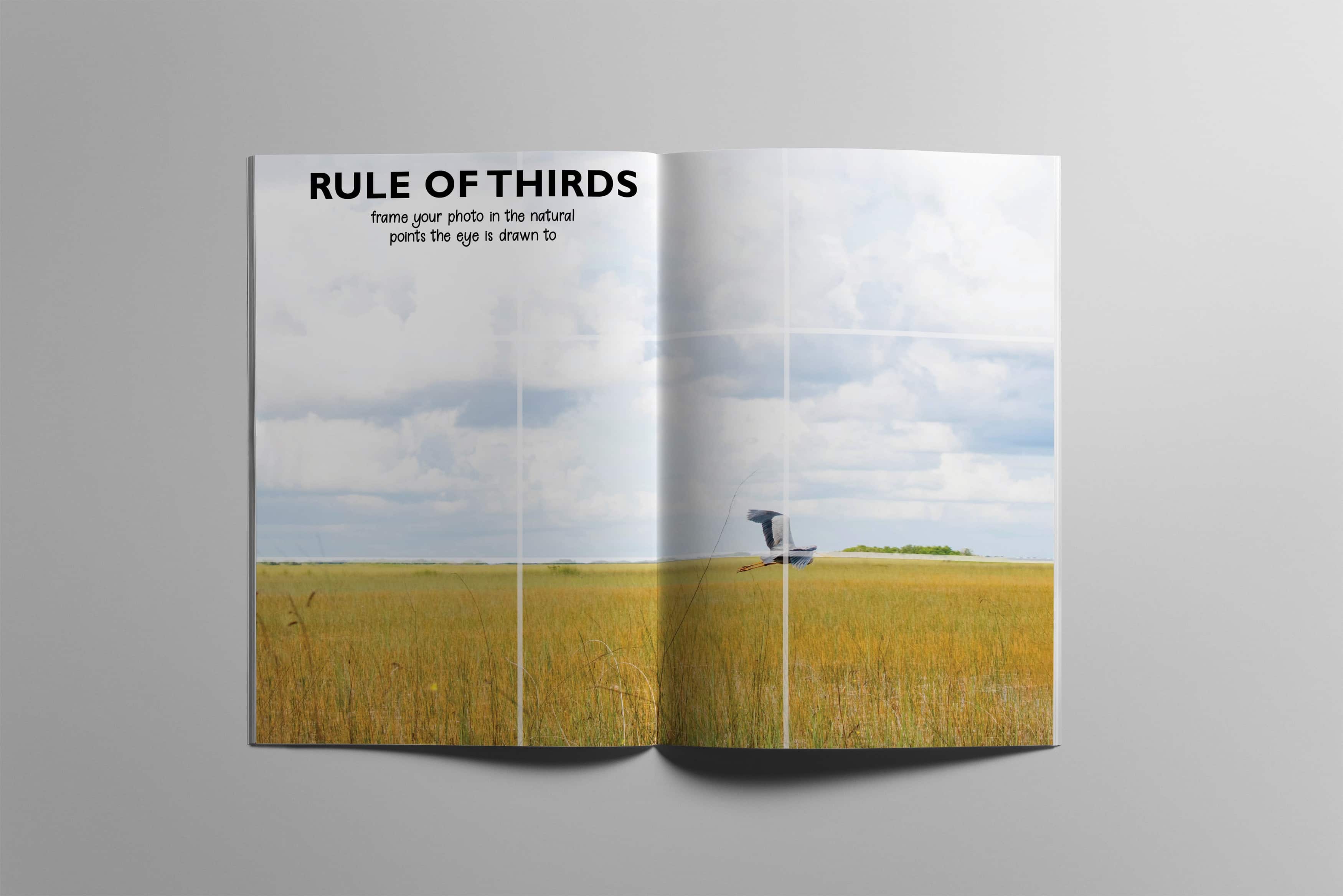
This was a class project to design and print out a zine using InDesign, so I was solely in charge of coming up with the content, layout, and going through the process of printing and assembling. I was about to leave to work as a photographer for the summer, so I made a mini handbook for settings and tips when shooting manually.
MY SOLUTION
To achieve my goal, I varied the number, size, and layout of the pictures to add interest, and kept fonts, background colors, and the white borders consistent to achieve cohesiveness. I wanted the zine to be easy to flip through to find specific information quickly, so I kept the writing short and to the point, using arrow designs to further highlight specific points in a photo that the text was describing. I was meticulous in the arrangement of content as well, beginning with the most basic step and flowing through the natural process of thinking and shooting.
font I chose the bold typeface for the headings to make it easy to read and find what is needed while being flipped through. The handwritten looking text gave it the feel of a field notes journal that some photographers carry around with them, and I wanted this to be a little journal that anyone could carry with them on their travels to help out.
color The color scheme was pulled out of the photo on the cover spread so that it would all feel cohesive. I chose the orange from the sunset so that it is something that is more eye-catching than white, while still being neutral enough to not clash with the wide variety of photos inside.


